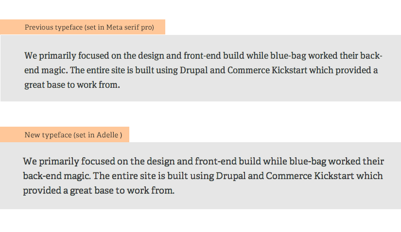
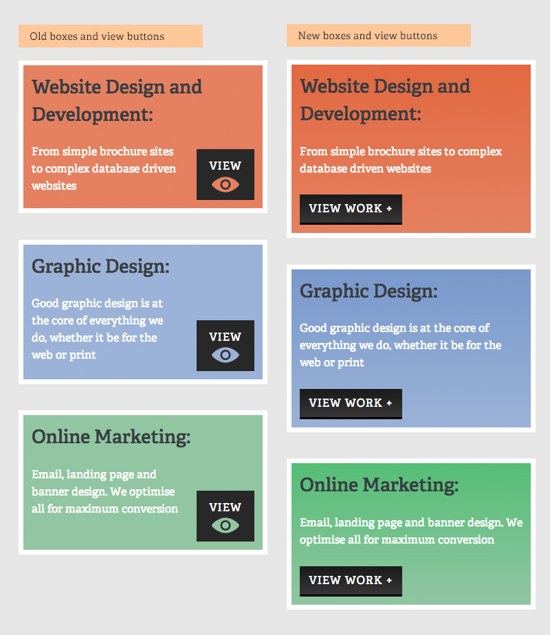
A quick writeup highlighting some of the website elements we’ve changed during a subtle redesign of our site.
We launched the redesign of the SketchCode Studio site almost a year ago, and since then we’ve been very happy with it, but there’s always things that can be improved, and by looking at our website analytics, we spotted a few areas that we felt could be improved a smidge. It’s not a huge re-thinking or as big of an undertaking as the last redesign was, but it has several areas that have been tweaked and improved. I took screenshots of the old and new versions for comparisons which I’ve uploaded below:


Individually these changes might not look like much, but when added together they’ve really helped to improve the site and breath a bit of new life into the design without it needing a complete overhaul.
I’ve also made some behind the scenes changes, including optimisation of the javascript/jQuery that should improve the loading time of the site as well as improving the markup of the site templates by adding in some relevant schemas, i.e., html tags, that are recognised by major search providers. Search engines including Bing, Google and Yahoo! rely on this markup to improve the display of search results, making it easier for people to find the right web pages.